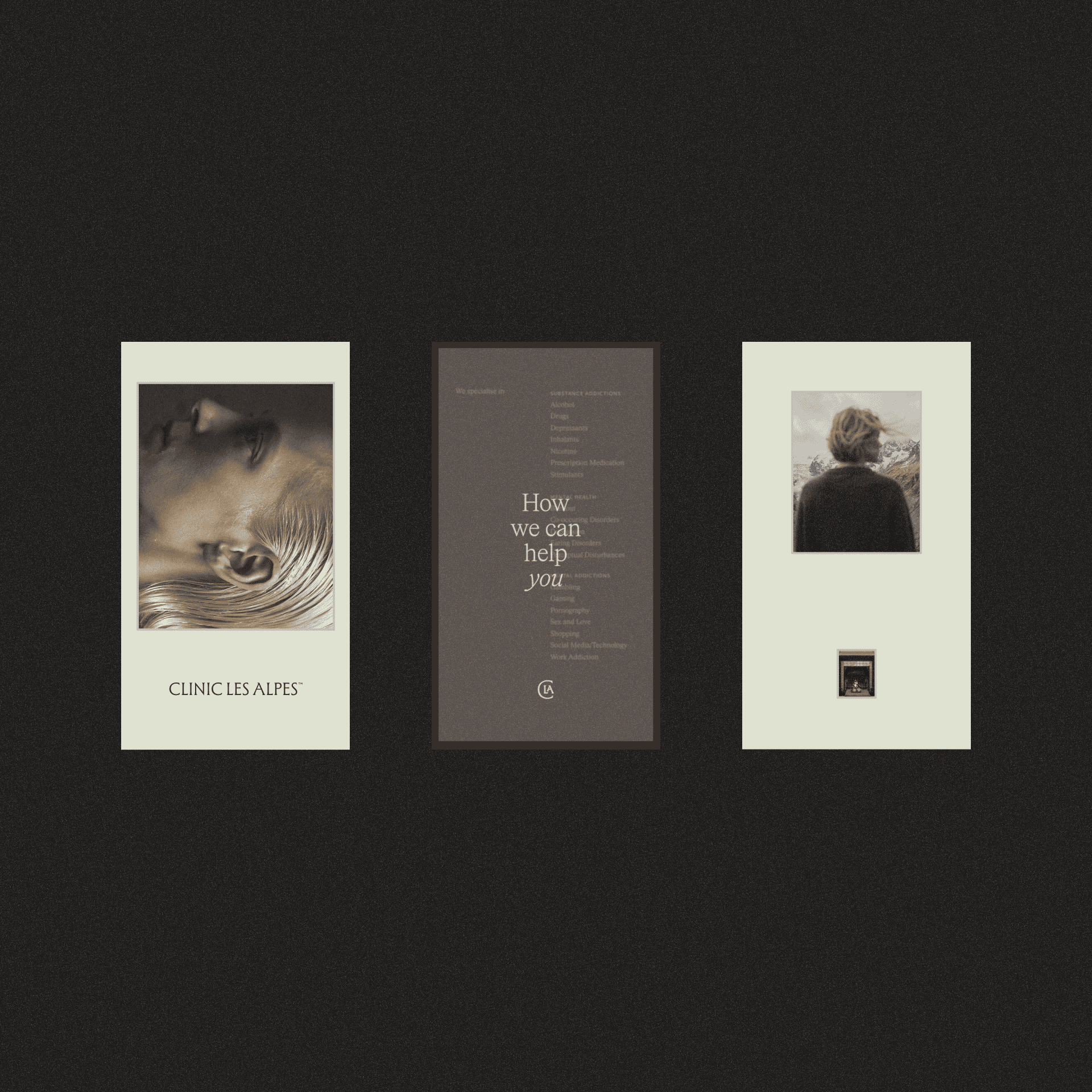
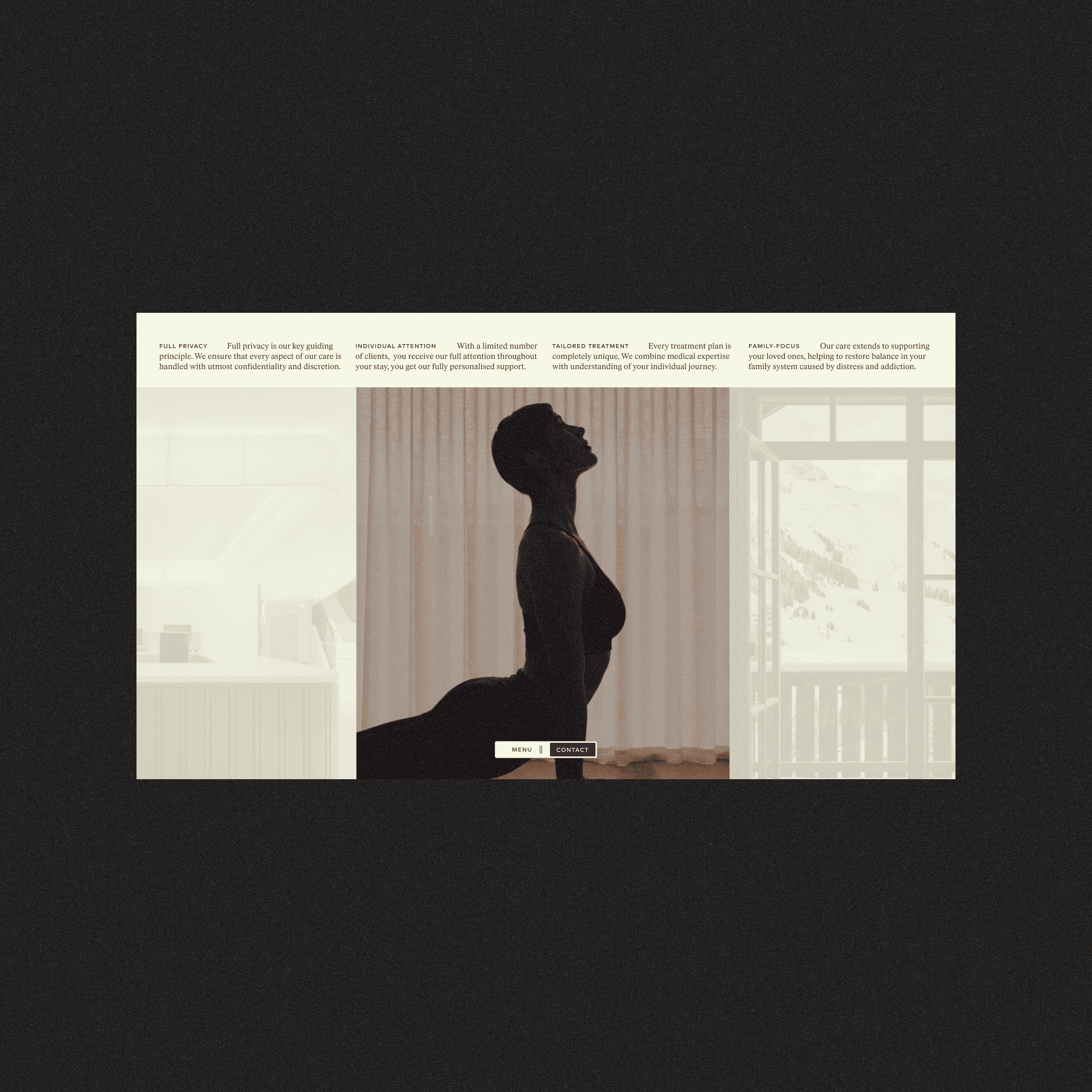
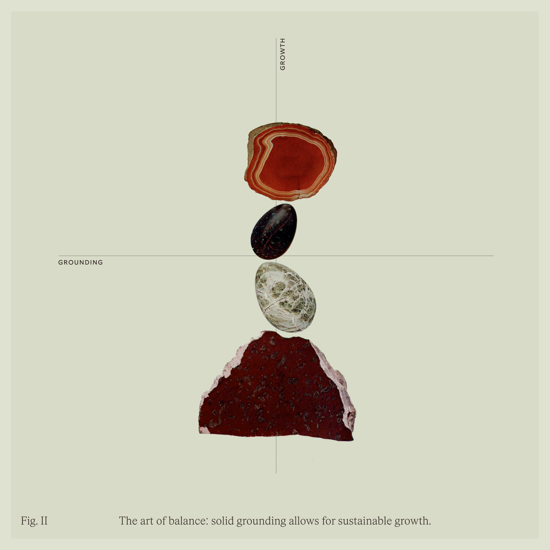
Balance. Break. Build. Repeat: Crafting a brand identity for CLINIC LES ALPES required weaving together four distinct threads: the clinical precision, the warmth of luxury hospitality, the artistry of haute cuisine, and the historical gravity of a Belle Époque château. To communicate this balance, I steered the art direction and social media strategy away from literal depictions of rooms or treatments. Instead, I focused on metaphorical visuals that mirror the internal journey of the mind. the visual narrative frames recovery as a communal, cumulative act of stability.
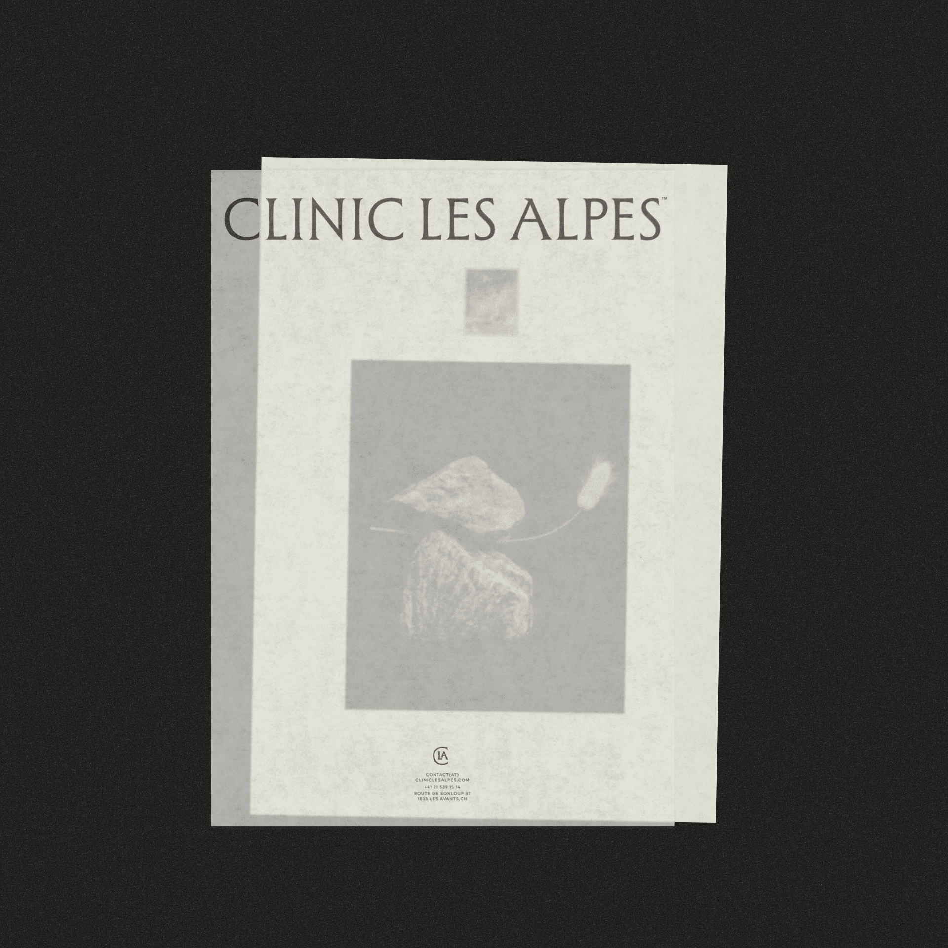
FIG 1. Steinmann: traditionally built by travelers in the Alps to mark safe passae through difficult terrain and poor visibility, these stone stacks symbolize the clinic’s role as a beacon. Drawing on the tradition where each passerby adds a stone to stabilize the structure against the wind and let the others know they're on the right path ahead.